The brand
This is Hello Rose
One rose, one warm voice, one promise kept every day. This page is where we keep the pieces that make Rose feel like Rose — what we believe, how we talk, and the logo, color, and type behind it. In plain language, no legalese.
Why we exist
The mission
Someone lovely calls your mom every day — company for them, peace of mind for you.
Rose phones your parent for a warm chat, remembers everything they talk about, and sends you the story of their day. Built for families who live too far away to drop by. That’s the whole idea — no bigger claim hiding underneath it.
How we think
Mindset & goals
A few decisions we made on purpose — the kind that change what we build on an ordinary Tuesday.
Warmth first, always honest
The feeling is warm and human. The facts are true and plain. When those two pull apart, honesty wins — warmth recedes and clarity takes over the moment anything is actually wrong.
Not everything, one thing well
Hello Rose is companionship and a caring check-in — not healthcare, not an emergency line, not for kids. We say no to the next feature so we can keep the one promise.
Earn the trust daily
Families hand us someone they love. The goal isn’t a call placed — it’s a parent who feels less alone and a family that feels at ease. We measure ourselves on that.
What we believe
Beliefs, as trade-offs
Values only mean something if the opposite was a real choice someone could have made. Here are ours, with the road not taken visible.
We choose an honest sentence over a comforting one.
Rose introduces herself as an AI on every single call — no pretending, ever. If saying the true thing is a little less magical, we say the true thing.
We choose their yes over our growth.
The parent's own consent is the one that counts. One sentence to Rose, on any call, stops the calls forever — no questions, no persuading. A retention team would hate that rule. We keep it anyway.
We choose plain words over legalese.
Everything we ship — safety promises, pricing, the fine print — is written the way you'd explain it to a friend. If a lawyer would write it one way and a daughter another, we write it the daughter's way.
We choose a real conversation over a scripted one.
Rose remembers what your parent told her yesterday and picks the thread back up today. The point was never a checkbox call. The point is that someone actually listened.
Who Rose is
Personality
Four traits, each with the failure mode it isn’t. The ‘but not’ is the whole point — it’s what keeps warm from turning into gushing.
Warm but not saccharine
We sound like someone genuinely glad to hear from you — not a greeting card, not a wellness script.
Plain-spoken but not cold
We say the simple thing gently. No jargon, no hedging, no corporate fog — but never clinical either.
Honest but not blunt
We tell the truth about what Rose is and isn't. Kindly, and once — we don't cushion it into mush or drop it like a brick.
Steady but not scripted
Families are trusting us with someone they love. We sound like we can be counted on — calm, present, the same Rose every day.
How we talk
Voice & tone
The voice never changes. The tone shifts with what’s at stake — lighter for a routine chat, plainer and slower the moment something sounds wrong.
The mark
Logo
A single hand-drawn rose — a bloom that spirals inward, on a stem with two leaves. Give it room and let it stay a rose.
Rose mark
Wordmark lockup
On ink
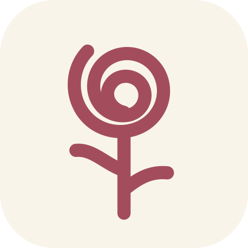
The app icon
The rose sits centered on a #f9f4ea rounded square with generous padding. This is the only crop of the mark inside a container — everywhere else it breathes on its own.

Do
- Give it clear space — at least the height of the bloom on every side.
- Keep it in rose on cream, or a light mark on ink.
- Keep the mark at least 24px tall so the spiral stays legible.
Don’t
- Recolor, rotate, stretch, or add a drop shadow to the mark.
- Place it on a busy photo or a low-contrast background.
- Redraw the rose or swap in a different flower.
The palette
Color
A warm, papery world with one dusty rose doing the talking. Rose for action, ink for words, cream for everything underneath.
Rose
Brand primary · buttons, links, accents
Rose deep
Hover & pressed states
Rose soft
Chips, badges, tinted panels
Rose whisper
Faintest rose wash
Paper
Primary background — the cream
Paper deep
Borders, dividers
Cream
Cards, photo mats
Ink
Primary text — warm near-black
Ink soft
Body & secondary text
Ink faint
Muted / tertiary text
Leaf
Secondary accent — the stem
Gold
Tertiary accent
Contrast, checked
Ink on paper lands around 15:1 (AAA). Rose text on cream is about 5:1 and white on rose about 5.5:1 — both clear WCAG AA for text. Keep rose for accents and buttons; for long reading, use ink and ink-soft.
The type
Typography
Three faces, each with one job: a soft serif for headlines, a clean sans for reading, and a handwritten note for the human touch.
Display
Fraunces
var(--font-display)
Headings only (h1–h3). We run the variable SOFT axis at 60 for a rounder, gentler serif, with -0.01em tracking and semibold as the ceiling — never bold.
Someone lovely calls
Body
Instrument Sans
var(--font-body)
Everything you read — paragraphs, labels, UI. Stylistic set 1 is on. Weights: normal, medium, semibold.
Company for them, peace of mind for you.
Hand
Caveat
var(--font-hand)
A rare handwritten accent — a footer note, a sign-off. Used like a margin scribble, never for anything you have to read.
tell your mom Rose will call tomorrow
The pictures
Imagery
Real people in real moments, framed like a photo pinned to the fridge — a paper mat, a small tilt, a caption in Rose’s hand. Never staged stock, never a call center.
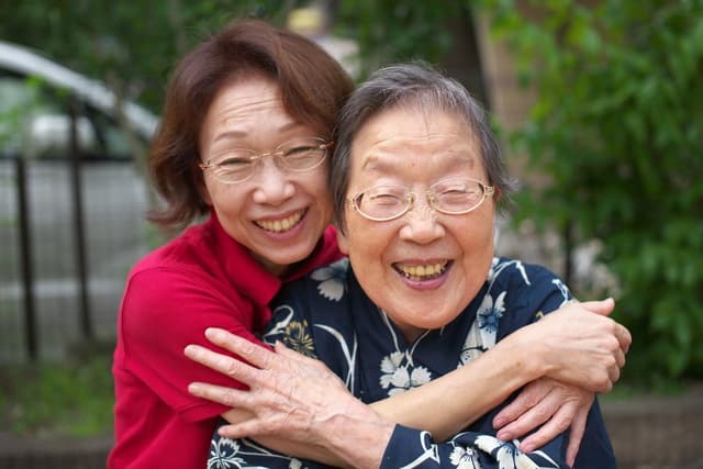
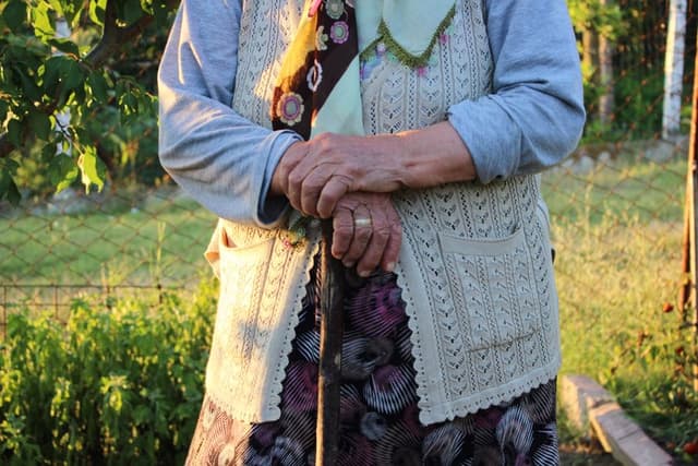
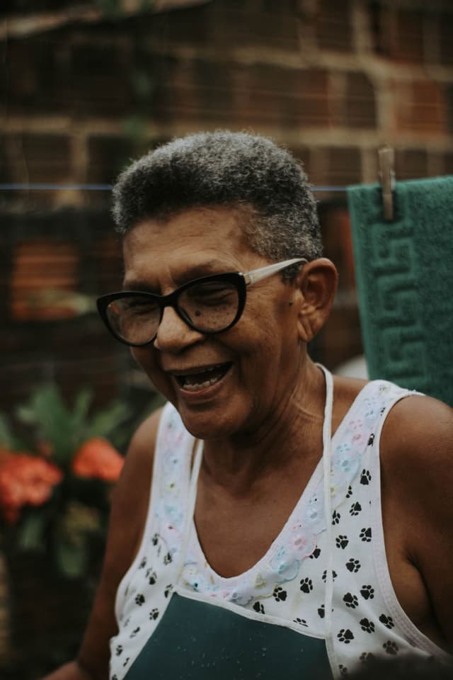
A quiet paper-grain texture sits over the whole site at 5% opacity, so even flat screens feel a little handmade.
The feel
UI signatures
Soft corners, warm shadows, and buttons that lift when you reach for them. Nothing is sharp; nothing is pure black.
Buttons
Primary is a rose pill that lifts on hover. Secondary is a soft outline that warms to rose.
Shape & depth
- Radius: rounded-full for buttons & chips, rounded-3xl for cards. No sharp corners, anywhere.
- Shadows: warm ink at low opacity — lift for buttons, card for panels, photo for polaroids. Never pure black.
Questions about using the Hello Rose brand, or need an asset that isn’t here? Get in touch.
— the whole Hello Rose family